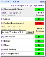
I have started another mini tool which will be a part of the TimeIsMoney project. Activity Tracker. Look at the simple example. Right now I am using this tool in my job. It’s great but for my project i need something more advanced.
Activity Tracker from the ScreeperZone
This tracker is a windows gadget. There was an idea to create some sort of the link between TODO List and this application, but I have encountered several major problems. It’s a windows gadget so it’s created from the simple html with JavaScript, and its data is stored in Json format. Accessing and modifying this data would be a simple task but the application refreshes its data only on the start. There is no way to invoke the data refresh without restarting the Activity Tracker. So there is only ability to “bind the data between application in OneWay”. I need this communications to be “TwoWay” Because of this problem and some other constraints, I have decided to create my own application from the scratch.
Ideas
-
Time spent calculation.
-
Application will read the xml list. User will have the ability to select lists and items to track.
-
activity log – needed for the reports module.
UI Concept
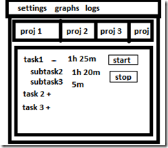
This is a simple concept created in … MS Paint. As you can see its just a TabControl with a customized TreeView. Items in the treeview will display the title time spent + time estimated by the user. There is a button which is used to activate the time counter. You will be able to check the comments attached to a task by right clicking on the item.
Implementation
I created styles first. Yeah i know that you should implement the Model and Controller first and then move to the View. The styling in WPF is so great that i couldn’t resist.
TabItem Custom Styles
<Style TargetType="TabItem">
    <Setter Property ="Template">
        <Setter.Value>
            <ControlTemplate TargetType="TabItem">
                <Grid>
                    <StackPanel Orientation="Horizontal">
                        <Border Name="Border" Padding="2" BorderBrush="Black" Borde                            rThickness="1,1,1,1"
                    CornerRadius="10,10,0,0" Background="DarkOrange">
                            <ContentPresenter Name="PART_header" ContentSource="Header"/>
                        </Border>
                    </StackPanel>
                </Grid>
            </ControlTemplate>
        </Setter.Value>
    </Setter>
</Style>
Most Interesting part in, here is a ContentPresenter this tag represents the place where the actual data of an item will be displayed. By specifying the ContentSource, we can inject the data to it. By using the ContentPresenter, I can create a TabItem and specify its attribute Header.
1 «/span>TabItem Header=”Projekt1”/></div>
The value in Header will be automatically inserted in the place of the ContentPresenter.
TabItem Triggers – Changing color of TabItem
WPF is great because it lets you omit a lot of code. To do the simple Background color change in a Windows Forms you would have to write a lot of code. More code means more bugs, longer development time, and the cost of a product.
In this scenario, we want the background color of the Tabitem to change when it’s selected. In WPF, we don’t need to write a single line of code. Xaml and its magic is enough for this task. To implement a simple behavior, we can use the Triggers.
<ControlTemplate.Triggers>
    <Trigger Property="IsSelected" Value="True">
        <Setter TargetName="Border" Property="Background" Value="Gold"/>
    </Trigger>
    <Trigger Property="IsSelected" Value="False">
        <Setter TargetName="Border" Property="Background" Value="DarkOrange"/>     </Trigger>
</ControlTemplate.Triggers>
As you can see Trigger “observes” a property and its value. In this example, it’s the IsSelected property. I need two triggers one for each option. Trigger contains a setter logic which is used to apply the changes. The Setter is attached to a property of a target and changes its value.
TabItem Triggers – Changing color of TabItem
<Style TargetType="{x:Type TabControl}">
    <Setter Property="Template">
        <Setter.Value>
            <ControlTemplate TargetType="{x:Type TabControl}">
                <Grid>
                    <Grid.RowDefinitions>
                        <RowDefinition Height="Auto"/>
                        <RowDefinition Height="*"/>
                    </Grid.RowDefinitions>
                    <TabPanel Grid.Row="0" Panel.ZIndex="1" Margin="0,0,0,0" IsItemsHost="True" Background="Transparent"/>
                        <Border Margin="0,0,0,0" Padding="0" Background="Gold" Grid.Row="1" BorderBrush="Black" BorderThickness="1,1,1,1">
                            <ContentPresenter ContentSource="SelectedContent"/>
                        </Border>
                    </Grid>
                </ControlTemplate>
            </Setter.Value>
        </Setter>
    </Style>
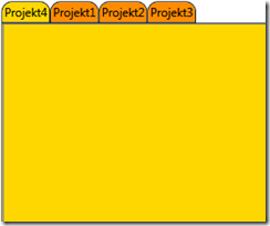
Last Thing to style is a TabControl. I need a customized background for every item in the Control. ContentPresenter is attached to a SelectedContent. This is the place where a Content of a Selected TabItem is displayed.
That’s all for now. Next Chapter simple Data Binding.


